Technical or fundamental analysis? What each one measures
Fundamental analysis is the study of what a business is worth. Technical analysis is the study of what its chart is doing. They are looking at two different things, and the most useful moment is when both of them are saying the same thing at once.
Here is what is actually inside each one.
What is fundamental analysis?
Fundamental analysis estimates what a company is worth from its financials and its future prospects — revenue, earnings, margins, debt and growth. The output is a view on whether the price you are being asked to pay is high or low relative to the business underneath it.
Most of it comes down to ratios, and every ratio is the same idea: price on top, something real about the business underneath. A big number means you are paying a lot for each unit of that thing. What counts as “a lot” depends on the industry and on the company’s own history, which is why a ratio in isolation tells you almost nothing.
| Ratio | How it is calculated | What it tells you |
|---|---|---|
| P/E | Price ÷ earnings per share | What you pay for a dollar of profit |
| PEG | P/E ÷ earnings growth rate | The P/E adjusted for how fast it is growing |
| P/S | Price ÷ revenue per share | What you pay for a dollar of sales |
| P/B | Price ÷ book value per share | Price against what the company owns |
| Debt / equity | Total debt ÷ shareholder equity | How much of it is borrowed |
| ROE | Net income ÷ shareholder equity | How well it turns capital into profit |
P/E — the one everybody starts with
A stock at $50 earning $2.50 a share has a P/E of 20. You are paying $20 for every $1 of annual profit. On its own that is neither cheap nor expensive. Utilities routinely trade in the teens; software routinely trades at four times that, because the market expects the profit to be much larger later.
Which is why the useful comparison is not against the market. It is against the same company’s own history and against its direct competitors. A business trading at 14 when it has averaged 22 for a decade is saying something. A business trading at 14 next to an index at 20 is saying nothing at all.
PEG — P/E with the growth put back in
P/E punishes fast growers, because it only looks at profit today. PEG divides the P/E by the earnings growth rate to correct for that. A P/E of 30 with 30% growth gives a PEG of 1.0; a P/E of 15 with 5% growth gives 3.0 — so the “expensive” one is arguably the cheaper of the two.
The catch is that the growth number is a forecast, and forecasts are where optimism hides. PEG is only ever as good as the growth rate you fed it.
P/S and P/B — for when earnings are not the story
P/S uses revenue instead of profit, which makes it the one that still works on a company that is not profitable yet. Early-stage and high-growth names get measured this way out of necessity.
P/B compares the price to what the company owns on paper. It is most useful for banks, insurers and anything asset-heavy, where the balance sheet genuinely is the business. It is close to useless for a software company whose main asset is people.
What is technical analysis?
Technical analysis is the study of the chart itself — price action, volume, indicators and patterns. It ignores what the company does and reads the behavior of everyone buying and selling it. Underneath all of it is one idea: supply and demand leave a visible trace.
Price action and volume
The base layer is trend. A series of higher highs and higher lows is an uptrend; lower highs and lower lows is a downtrend; anything else is a range. Levels where price has repeatedly stopped falling are support, and where it has repeatedly stopped rising, resistance.
Volume is what separates a move that means something from a move that does not. A breakout through resistance on heavy volume says real buyers showed up. The same breakout on thin volume often gives the whole move back within days. Volume is the confirmation, not the signal.
Moving averages
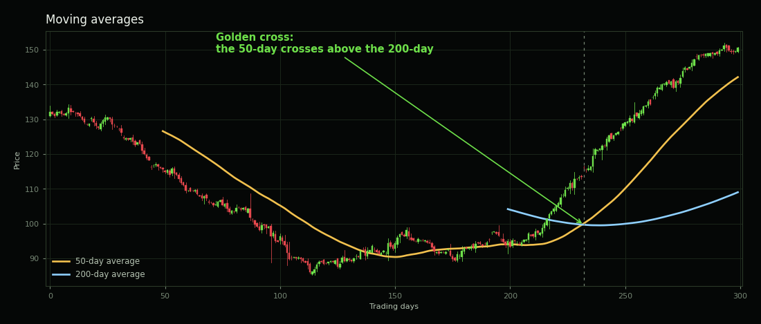
A moving average is just the average close over the last N days, redrawn each day. The 50-day and the 200-day are the two everybody watches, which is part of why they matter — enough people act on them that they become real levels.
RSI and MACD
| Indicator | What it is | Common reading |
|---|---|---|
| RSI | Speed and size of recent moves, on a 0–100 scale | Above 70 “overbought”, below 30 “oversold” |
| MACD | The gap between two moving averages, plus a signal line | Crossing above the signal line reads as momentum turning up |
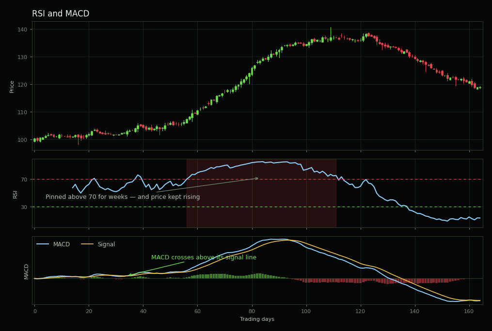
That picture is the reason to be careful with the textbook readings. An RSI above 70 does not mean a stock is about to fall. Strong stocks in strong trends sit above 70 for weeks while everyone who shorted the “overbought” signal gets run over. Indicators describe what has already happened; they do not promise what comes next.
What are the main chart patterns?
The patterns worth knowing well are the bases — the sideways stretches a stock builds after an advance, before it makes its next move. What makes a base more useful than a shape with a name is that each one comes with a defined buy point, so there is something to act on rather than something to admire.
Three rules run through all of them:
- A base needs a prior uptrend. These are continuation patterns. A stock that has gone nowhere for two years is not building a base, it is just going nowhere.
- The buy point sits above the pattern, not at the bottom of it. You are paying for confirmation. Buying the low is buying a hope.
- Volume has to show up on the breakout — the common threshold is at least 40–50% above the 50-day average volume. Without it the breakout is a guess.
Cup with handle
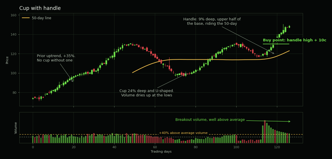
A prior advance, then a rounded correction of roughly 12–33% that takes weeks or months to complete, then a small pullback near the old high. The cup should be U-shaped rather than a sharp V — the rounding is what tells you sellers left gradually instead of all at once.
The handle is the part people get wrong. It should form in the upper half of the base, drift down rather than plunge, usually ride along the 50-day line, and take about 8–12% off the high. A handle in the lower half of the base is not a handle; it is the stock failing.
Double bottom
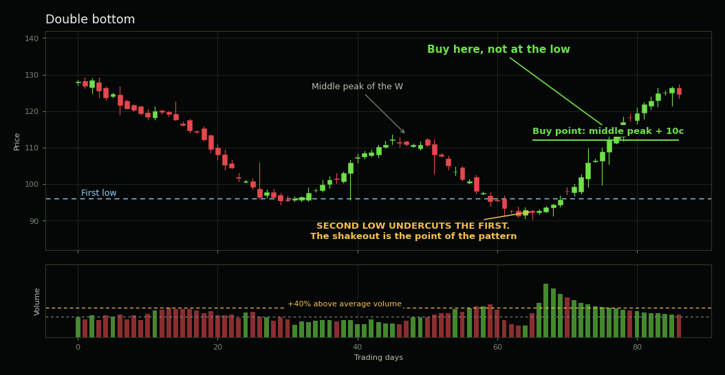
A W. And the detail that makes it work is one most explanations leave out: the second low should undercut the first.
That is not a flaw in the pattern, it is the mechanism. Everyone who bought the first bottom has a stop sitting just underneath it. Dipping through that level takes those stops out and shakes the weak holders loose, so the stock starts its next move with the impatient money already gone. A tidy W whose second low stops politely at the same level has not done that job.
The buy point is the middle peak of the W — not the low. You are waiting for the stock to prove it can get back through the level that stopped it last time.
Flat base
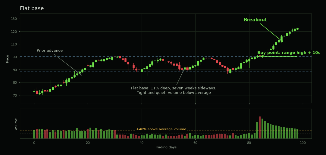
A shallow sideways range — 15% deep at most, five weeks at minimum — which usually forms after a stock has already broken out of a cup and advanced. Nothing dramatic happens in it, which is exactly the point: a stock that refuses to give back its gains while the market chops around is a stock being accumulated rather than sold. The buy point is the high of the range plus ten cents.
Can you use both together?
Yes, and the serious growth-investing checklists do exactly that — not as a compromise between two camps, but because the questions they ask fall naturally on both sides of the line.
| What you check | Which kind |
|---|---|
| Earnings growing sharply this quarter | Fundamental |
| Earnings growing over several years, not just one | Fundamental |
| Margins and debt that can support the growth | Fundamental |
| Something new driving it — product, management, market | Both |
| A finished base and a buy point taken | Technical |
| Volume confirming the breakout | Technical |
| Outperforming the market rather than lagging it | Technical |
| Large investors accumulating rather than selling | Both |
| The general market going in your direction | Technical |
Read down that table and the division answers the question on its own. The fundamentals tell you what is worth owning. The chart tells you whether anyone else has noticed yet. A company can be cheap by every ratio further up this page and keep getting cheaper for two years, because value on its own is not a catalyst. Equally, a chart can look perfect on a business that is quietly falling apart.
The setup worth waiting for is when the two agree: a business whose numbers hold up, and a chart where the base is finished, the buy point is taken, and volume says real money came with it.
There is also a way of combining them that is not combining them at all. You buy on a chart, it goes against you, and you reach for the balance sheet to justify holding. That is not using two methods — that is changing the test after seeing the result, and it turns a trade you had a rule for into a position you have a story for. The loss math is unforgiving about that particular habit: lose half and you need a double just to get back to even.
Which should you start with?
Your holding period decides it.
Over a single day, margins and earnings have not changed — price is moving on flow and sentiment, and there is very little for fundamental analysis to work on. Over ten years, price tracks the business and no chart pattern survives that long. The odds themselves shift as the horizon stretches, which is what the S&P 500’s win rate by holding period shows.
So the shorter you hold, the less time fundamentals have to matter. The longer you hold, the less any pattern does. If you do not know your horizon yet, that is the question to answer before you pick a method.
Both of these are easier to learn on real prices than on paper.
Social Bull is a simulator — live market data, virtual money — so finding out whether you can actually read a base or a balance sheet costs a lesson instead of a year’s savings.
For the fundamental side: value lines on every ticker, drawing that stock’s own ten-year average P/E, P/S and P/B straight over its price, so you can see whether it is cheap by its own standard instead of guessing what a normal multiple looks like. A full terminal on every name, and a screener across roughly sixteen thousand US stocks with strategy backtesting.
For the technical side: candles at every interval from one minute to one month, indicators, and a trade journal that tags every fill and reports the win rate per tag — so “my setup works” stops being a belief and becomes a number you can read.
Free, no card, and every position is simulated.
Open the app